🍪
Cookie Preferences
Please allow cookies to start chat.
Blog articles
View all
Explore every article across categories to fuel your business growth.
Boost News
Latest updates, announcements, and innovations from the Boost platform.
Case Study
Real-world examples showcasing success stories and proven growth strategies.
Search & Discovery
Insights on optimizing product visibility, navigation, and customer discovery.
Growth Tips
Actionable advice and tactics to accelerate your business growth.
Trends Insights
Stay ahead with data-driven market trends and behavioral insights.
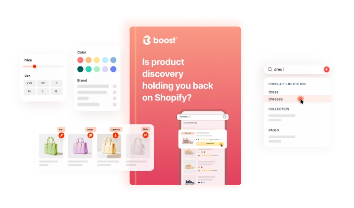
The best Shopify review platforms for product discovery, merchandising, and reputation management
Product
Features
AI search
Improve shopping experience with AI-powered search.
Product recommendation
Master recommendations with the help of AI & ML.
Visual merchandising
Increase sales by prioritizing items that are new, popular & high-margin.
Predictive bundles
New
Maximize AOV by suggesting product bundles to customers.
Pre-order
New
Build hype around new launches & get sales from sold-out items.
Personalization
Tailor shopping experiences to elevate your sales & growth.
Back-in-stock
New
Reduce lost sales of sold-out products with a “Notify me" button.
Global selling
Integrate with Shopify Markets & grow cross-border selling.
Navigation & filters
Enhance discovery experience with customizable filters.
Benefits
Klaviyo integration
New
Learn how Boost can help improve Klaviyo email conversions by up to 20%.
Insights & analytics
Gain insights into shoppers by analyzing their behaviors.
Integrations
Learn about Boost integrations with top eCommerce apps.
Pre-order feature available now!
Secure a sale even before the product is available.
Pricing
Resources
Learn
Success stories
Read results from brands that scale with Boost
View all case studies
Articles
What's new
Check out the latest news from Boost.
Blog
Stay informed with the latest trends in eCommerce.
Support
Help center
Access guidance & support instantly.
Tutorials
Watch our easy-to-follow tutorials.
Developers
Read documentation for developers.
Latest updates!
Keep up-to-date with the app changelog and be the first to know about new updates.
Book demo
All posts
eCommerce Search & Discovery
Shopify Experts Reveal 3 Best Tips To Display Values In Product Filters
Ellie Ho
June 17, 2024
May 19, 2022
•
5 min read
Discovery Playbook
Shopping shouldn’t feel like a chore
Search friction, dead-end browsing and poor recommendations could be driving your traffic away - and stalling your growth.
Download now
Make buying easier. Grow faster.
Get the guide to see where product discovery is slowing sales - and how to fix it so customers find what they need, buy faster and spend more.
Enter your email address
Your Playbook is on its way to your email inbox. It should arrive in the next few minutes.
Get started
Trusted by fast-growing brands
Start your 21-day free trial
Get started
Ellie Ho
•
Content Marketing Specialist
May 19, 2022
•
5 min read
There's More
Related Posts
eCommerce Search & Discovery
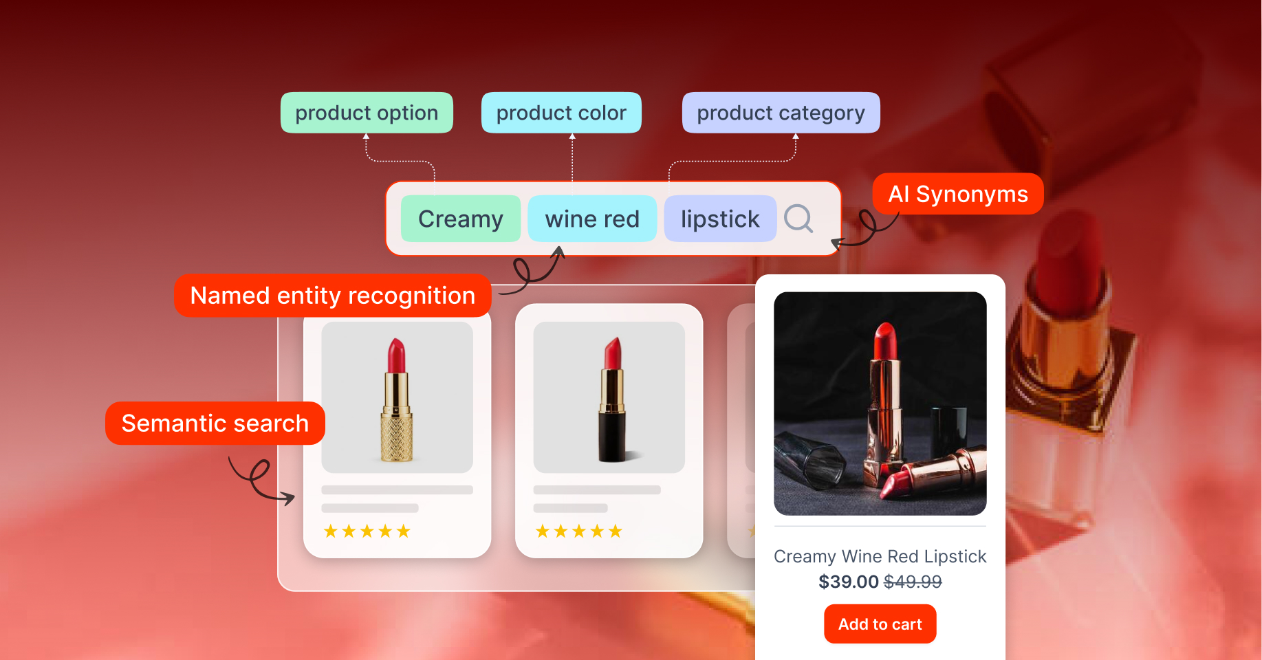
Semantic Search for Shopify: Everything You Need To Know (2026 Update)
Doki Nguyen
January 21, 2025
eCommerce Search & Discovery
Everything An eCommerce Store Owner Needs To Know About Dynamic Filtering
Ellie Ho
February 25, 2022
eCommerce Search & Discovery
[Infographic] Dig Into Search Foundation Of Boost AI Search & Discovery
Ellie Ho
August 13, 2023


